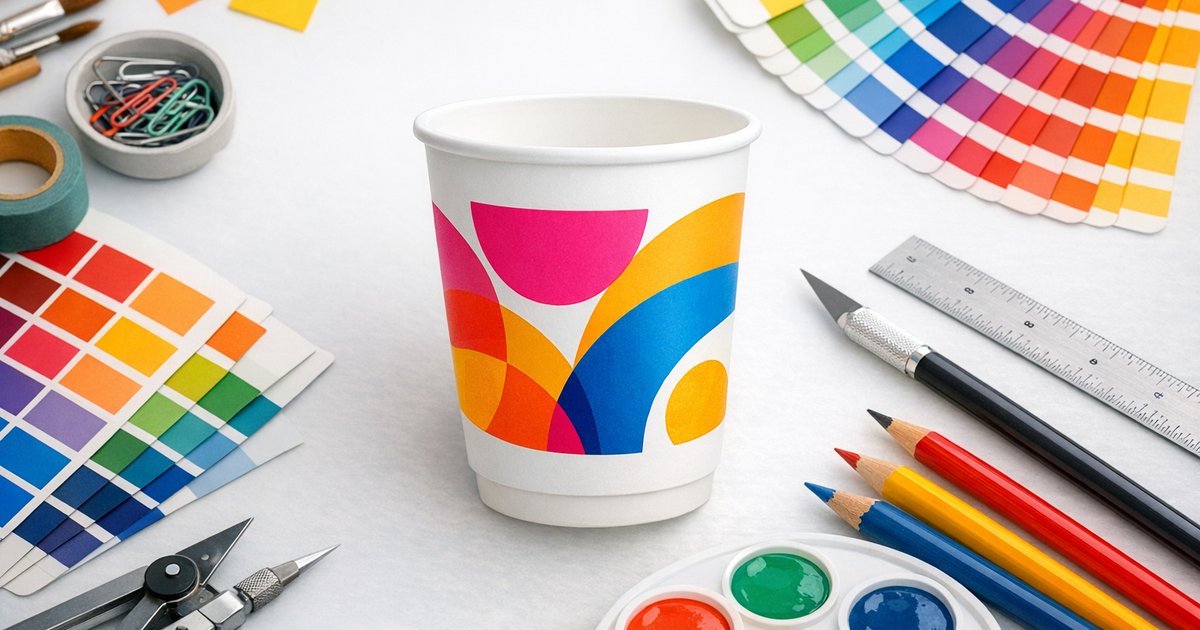
How to Make Your Brand Colours Pop on a Paper Cup
Short answer: Yes — you can make your brand colours on a paper cup look vibrant and consistent. Key steps: choose a white base or double-wall substrate, boost saturation and use dense CMYK fills for large areas, and always request a physical proof or our sample pack before full production. Minimum order is 500 cups.
Why paper changes colour (and what to do about it)
Uncoated and compostable papers absorb ink, so colours frequently appear softer, less saturated or slightly darker than on-screen. The cup substrate and any coatings change how light reflects and how ink lays down—understanding these limits helps you design for real-world colour, not just monitor colour.
Quick trade-offs to remember
- Boosting saturation increases perceived vibrancy but can raise ink coverage and drying time.
- Large full-wrap solids use more ink and can make the cup look darker overall.
- Fine detail and very thin type can blur on absorbent stock — simplify or weight up small elements.
Practical tips to make your brand colours on a paper cup pop
Use the following printer-friendly techniques for consistent, vibrant results across single-wall, double-wall and compostable cups.
1. Boost saturation and use dense fills
Slightly increase saturation to compensate for ink absorption. For large areas, use single dense CMYK mixes rather than screened tints to keep colour even. Avoid pale tints across big panels — they often look washed out on paper.
2. Choose the right cup substrate
A white cup base reproduces colours truest. Colours printed on white single-wall or double-wall cups match physical proofs more closely than those printed on kraft or unbleached stock. If exact colour fidelity matters, choose a white double-wall option where available.
3. Prefer smoother surfaces for crisper colour
Double-wall cups typically have a smoother outer surface than some single-wall options, which helps edges stay crisp and colours look more consistent. For best results see our Custom printed coffee cups product page for details.
4. Use contrast and bold accents
High contrast improves legibility and perceived vibrancy — dark type on light backgrounds or vice versa. If your brand palette includes mid-tones or pastels, add high-contrast bands, borders or accent colours so key elements pop on the cup.
5. Pick colours that reproduce well
Deep blues, rich reds and saturated greens generally reproduce better than delicate pastels. For pale brand colours, choose slightly richer or complementary variations so they read clearly on-cup without losing the brand feel.
6. Design for print resilience
- Avoid ultra-fine hairlines and tiny type; use heavier weights for small text and logos.
- Set large solids as rich blacks or dense CMYK mixes (example rich black for solids: C60 M40 Y40 K100).
- Convert files to CMYK and avoid relying on RGB or unnamed spot colours.
7. Prepare correct files and request proofs
We print in full-colour CMYK. Use our artwork templates (AI & PSD) and upload a print-ready PDF. For critical brand matches, order a sample pack and request a physical colour proof before production.
Full-wrap vs logo-on-white — which works best?
Both approaches can look great; the choice comes down to brand impact, budget and sustainability priorities.
Full-wrap
- Bold, immersive brand presence.
- Higher ink usage; full coverage can make overall colours appear darker.
- Requires careful bleed and wrap registration in artwork.
Logo-on-white
- Cleaner edges and usually the truest colour reproduction.
- More cost-effective and easier to proof for colour accuracy.
- Ideal when exact brand colour matching is essential.
Proofing, testing and avoiding surprises
Follow these recommended steps to check how your brand colours on a paper cup will look in real life:
- Convert artwork to CMYK and upload a print-ready PDF using our templates.
- Order a sample pack to check colour, texture and legibility on the actual cup stock.
- Approve a physical colour proof or request saturation/contrast tweaks before production.
Production details and lead times
Plan your project with these Australian-focused details. Minimum order: 500 cups.
| Minimum order | 500 cups |
|---|---|
| Cup types | Single-wall (PE), Double-wall (PE), Double-wall Compostable (PLA/CPLA) |
| Sizes | 8oz, 12oz, 16oz |
| Printing | Full-colour CMYK |
| Standard turnaround | 10 business days production + 2–3 days metro freight |
| Rush option | 5–7 business days production |
For current prices, see the printed coffee cups page.
Freight charged at cost (varies by quantity and destination). We offer free artwork templates.
Artwork help and services
- Use our artwork templates (AI & PSD) to set bleeds and dielines correctly.
- Take advantage of our design layout service — we’ll prepare print-ready files and a mock-up.
- See our complete buyer’s guide for more on materials and finishes.
Pre-press checklist
- Artwork converted to CMYK and checked against our templates
- Colours slightly boosted where needed to allow for paper absorption
- Large solids set as rich, dense fills (avoid screened tints)
- Readable type sizes and no ultra-fine hairlines
- Physical sample or proof approved for critical brand matches
Final thoughts
With a few artwork adjustments and the right substrate, brand colours on a paper cup can look bright, clean and consistent. White bases and double-wall cups give the truest reproduction, and changes to saturation, contrast and solid fills deliver big visual improvements without large cost increases.
Want to see your colours in real life? Order a sample pack or view our custom printed coffee cups to start a 500-cup run. We’ll help with templates, proofs and a print-ready layout so your cups look exactly as expected.
Questions about materials, finishes or colour matching? Contact us via the product page and we’ll walk you through options and timelines.