Short answer: For maximum visibility, place your logo on the drinking side (opposite the seam), sized for clear legibility with generous white space. We recommend a centred front logo for classic visibility, a repeated logo wrap for high impressions, or a small mark paired with a full‑wrap pattern for a premium look.
Why logo placement on coffee cups matters
Thoughtful logo placement turns takeaway cups into mobile advertising. Correct placement increases recognition in cafés, at events and on social media — and prevents common production problems like seam distortion or illegible small type.
Primary placement options
Centred on the drinking side (classic)
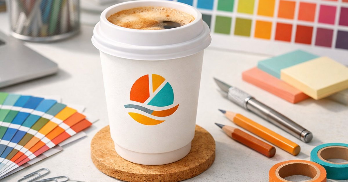
A centred logo on the drinking side (opposite the seam) is clean, readable and instantly recognisable when a cup is handed to a customer — ideal for cafés and daily takeaway service.
Repeated around the cup (high impressions)
Repeating a smaller version of your mark around the cup increases impressions as the cup turns in a crowd. Keep repeats small, evenly spaced and avoid adding extra text or elements that clutter the design.
Small logo with full‑wrap pattern (premium)
Use a subtle logo with a full‑wrap graphic or pattern for a boutique or premium feel. The wrap tells a story while the mark provides identity — great for retailers and limited‑edition runs.
Secondary mark or social handle (selfie side)
Reserve a small secondary mark, hashtag or social handle on the side that faces out when people hold the cup for photos. Ensure all text is legible at cup scale.
Drinking side, seam and the “selfie side”
- Drinking side (opposite the seam): Primary placement — people instinctively look toward the drinking hole.
- Seam awareness: Avoid placing key artwork across the physical seam to prevent distortion or misregistration.
- Selfie side: Use for a small call‑to‑action, hashtag or social handle to encourage shares.
Size and scale: how big should your logo be?
Aim for balance: readable from arm’s length without overpowering the cup. Use the drinking‑side logo as your primary size reference.
| Cup size | Recommended logo width (approx.) | Notes |
|---|---|---|
| 8oz | 45–60 mm | Classic cafés — keep the logo centred and clear |
| 12oz | 55–75 mm | Most common size — good balance of presence and elegance |
| 16oz (single‑wall only) | 70–95 mm | Large canvas — consider logo + tagline or a wrap |
Tip: If using percentages, aim for the logo width to be roughly 30–45% of the visible front area. For repeated logos, reduce each instance to around 30–50% of the primary logo size.
Colour, contrast and legibility
Good contrast is essential. Use dark marks on light cups or reversed white marks on dark cups. Avoid thin strokes, intricate detail or subtle gradients that may not reproduce reliably in print.
- Dark on light: The most reliable and cost‑effective option.
- Reversed white on dark: Works for bold marks — test fine details first.
- Full‑colour (CMYK): Available across cup types — use our templates to check colours and safe margins.
White space and layout principles
White space improves legibility and perceived quality. Maintain at least 10–15 mm clearance around the logo on small cups and scale that clearance proportionally on larger sizes.
Combining placements for maximum impressions
When budget allows, combine placements for layered impact:
- Main centred logo on the drinking side
- Smaller repeat logos around the cup body
- Secondary mark or hashtag on the selfie side
Production realities — minimums and lead times
Plan artwork and placements with these production facts in mind:
- Minimum order: 500 cups.
- Turnaround: Standard production 10 business days + 2–3 business days metro freight. Rush production 5–7 business days available.
- Design support & samples: free templates (AI, EPS, PDF, PSD).
Common mistakes to avoid
- Placing the logo across the seam or too close to the lid edge.
- Using tiny type or intricate details that don’t reproduce at cup scale.
- Neglecting contrast — subtle colour differences can disappear in print.
- Overcrowding the design — white space improves perceived quality.
Examples by business type
Cafés: Centre the logo on the drinking side for daily recognition and consistent branding.
Events & festivals: Use repeated logos around the cup to boost impressions in crowds.
Premium retailers: Choose a small logo with a full‑wrap pattern for a sophisticated, design‑led look.
Need help with artwork or a proof?
We provide artwork templates and a design layout service so you can test different logo placements before committing. Order a sample pack to check print quality, stock and colour in hand, or view our custom printed coffee cups to start a quote.
Quick checklist before you submit artwork
- Confirm primary placement (drinking side) and any secondary placements.
- Choose logo sizes based on cup size using the table above.
- Provide high‑resolution vector artwork (AI, EPS or PDF preferred).
- Check contrast and simplify fine detail for small prints.
- Request a digital proof and order a sample pack if unsure.
For a deeper overview of materials, finishes and ordering options, see our complete buyer’s guide. If you’d like us to mock up logo placement on coffee cups for your brand, request a quote for 500+ cups or order a sample pack. Our team will provide templates, a mock‑up and accurate lead times so you can choose the best logo placement for your needs.
Ready to make your brand more visible? View our custom printed coffee cups to start a quote or get a sample pack today.